A design + analog printing studio in Los Angeles

journal

design + letterpress printing in Los Angeles, California

Posts in custom
emma & yosi's thank you cards

This is the pomegranate that keeps on giving.​

Emma and Yosi have been showered with gifts even before their wedding date so to keep up with the correspondence, they tapped me to add one more component to really finish off their wedding suite - a matching thank you card. ​

Inside, we added that special touch and blind debossed  their names inside for that subtle but personalized touch!​

emma+yosi_thankyou_010.jpg
emma+yosi_thankyou_007.jpg
The Pomegranate Wedding

Emma and Yosi have a thing for pomegranates.

Sara Jensen is quite the pomegranate design specialist. She's a mommy and a witty graphic designer that has done some textile design using pomegranates as a source of inspiration. (Check it out here)​ Naturally, she designed an awesome invitation suite! It's not shown here, but the finished invitation will be wrapped in that pomegranate fabric tying the entire look together.

yosiandemma_008.jpg

The lovely couple also gave me the chance to try out my hand in calligraphy. I hand scribed nearly 100 addressed envelopes with white ink in one day! Yes, my hand was almost about to fall off by the end of it but I saw improvements already from the first envelopes to the last. Practice makes perfect.

​Special thanks to the Emma and Yosi for giving me the chance to work with them on their wedding suite, and to Sara for finding me and for making the introduction. It was such a fun process to work on this project not just because of the design ,but because of the people too.

yosiandemma_004.jpg
6 shades of business cards

This one was a fun one. This client came to me with a clear vision- he wanted his email address to take up the entire space of his business card. After refining and lots of kerning, I added the extra touch and suggested punching out the dots in his design.

It's clever, bold. memorable and, not to mention, economical. 

The Specs: 

  • chipboard paper and black illustration board
  • 3mm hole punched
  • dark grey ink (some shown with blind deboss)
  • 6 variations
​
​
the solo project

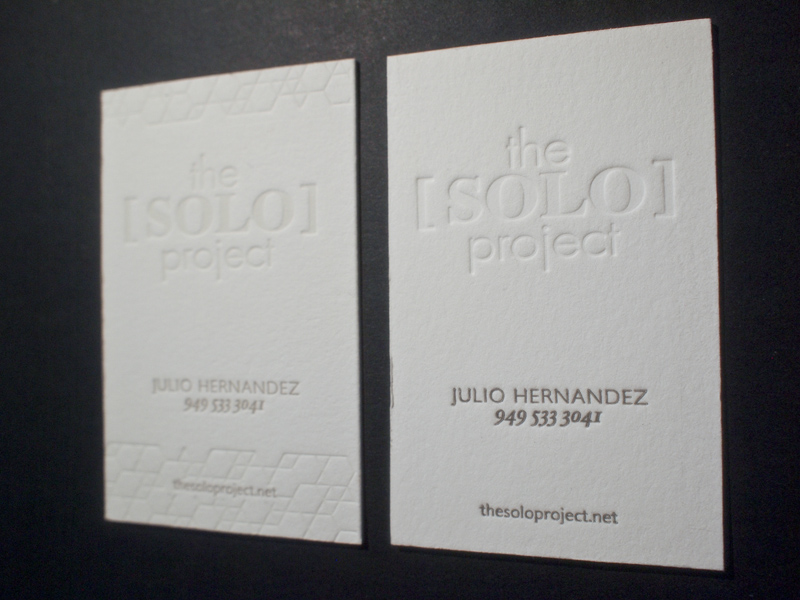
Here's are two variations on the same business card for a hair styling service, The Solo Project. Julio Hernandez, the man behind the concept, does amazing work (see his magic on my hair here).

The client requested a design with two variations of his card; one with a subtle geometric edging the card, and other with only type. Both are clean and minimal- just his style.

the specs:

European size business card
#220 Lettra Flourescent paper
2 color process (one with a blind deboss) 

​