A design + analog printing studio in Los Angeles

journal

design + letterpress printing in Los Angeles, California

Posts tagged calligraphy
the great romance

It's been a few weeks now since finishing some business cards for The Great Romance, a  wedding + life photography studio run by husband and wife team Tommy and Connie. Recently, they just launched their brand new, shiny website with a snapshot of the cards! At last, they've been officially revealed. That gold foil and calligraphy by Feast is so sumptuous.

Congratulations!  


day-of paperie

This Autumn season is filled with weddings. Not sure what it is about 2013, but this year had more wedding toward the end of the year than the usual "wedding season" in spring/early summer. For a few weddings, I've been lucky to also create matching Day-of paper goods for the wedding including namecards, signs, menus and favor tags all matching the invitation of course. 

Last week, I've been busy with ink and a calligraphy more than at the press wheeling paper through.  Here are some Day-of goods I've been working on lately.

-k


graham_067.jpg
IMG_6351.jpg
IMG_6335.jpg
P9257230.jpg

calligraphy hashtag signs

calligraphy hashtag signs

Hawaiian dessert signs

Hawaiian dessert signs

Robin + Johanna's 11x17 hand-painted signs for kids to hold while marching down the aisle.

Robin + Johanna's 11x17 hand-painted signs for kids to hold while marching down the aisle.

Jenny + Rachel: a 1920's beach wedding invitation
jennyandrachel_133.jpg
jennyandrachel_136.jpg
jennyandrachel_134.jpg
jennyandrachel_132.jpg
jennyandrachel_145.jpg

Jenny first approached me a few months ago with a clear vision in mind- they wanted to create a wedding invitation for their beachside wedding ceremony in Newport, Rhode Island, a port city rich in history dating back to mid 1600s. They wanted to play up the East Coast charm of the city keeping in mind it's colonial buildings, romantic seascape and their annual tradition of the Tall Ships.

They showed me a photo that was the main source of the invitation which was incorporated onto the backside of the wedding announcement. We wanted the 1920s to shine through the suite but still keep it modern, clean and elegant.

For a final touch, we added a handwritten touch with calligraphy touch the envelopes. 

The look and feel of this invitation has so much of their personal charm and it all started with one picture.


The specs: 

  • Custom design by Presshaus LA
  • Announcement: 220# Lettra Pearl white, 2/0 color with mounted digital print on Neenah's Classic Crest 100#.
  • RSVP + Info card - 2/0 color letterpress printed on 100# Lettra in Pearl White
  • Return address printed on kraft envelopes (RSVP envelope not shown)
  • Calligraphy by Presshaus LA


robin & johanna's wedding suite

Robin and Johanna let me run with it. Basically, they trusted me to create their wedding invitations.

Some background- my husband has been long time friends with Robin, and since we've been together, I've had the pleasure of knowing them before the process of creating wedding invitations. We knew them before they were even engaged!

With a ring on her finger now, Johanna asked me if I could help with her invitations. She had a few things on the prerequisites- colorful and bright with watercolors, not formal and one more thing- could you incorporate spam musubis? 
**Record scratch**  
Come again? A wedding invitation with Spam Musubi, the Hawaiian snack food with meat from a can
Yep.

Luckily, Richard and I had planned a trip to Hawaii to do some real R&D. We were on a mission to taste the hype around these musubis. You see, this couple are foodies. Whenever they like something, you know it's going to be good and they go beyond the restaurant and even learn how make it at home. They're those folks. 

Maybe it was the vacation effect, the beach only feet away, and the shining sun but man, those musubis from Iyasume were amazing! I was sold. We ate them almost everyday after that.

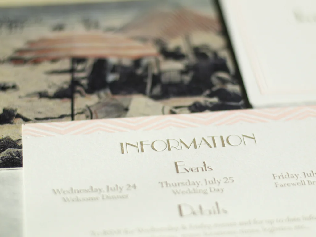
We came back inspired. We knew the magic of the spam musubi and knew the exact vibe they wanted for their invitation. Since this snack is so simple, we wanted to make a recipe as a bonus keepsake.

We played with watercolors on the side too. The Lettra paper holds up pretty well. Doesn't buckle too much but it really absorbs fast. We thought it would be cute too to keep the food illustrations for the RSVP card. A California roll seemed appropriate for their California reception party.

Only Robin and Johanna would have a one of a kind, colorful wedding invitation with spam musubis. I'm so pleased they're happy with how these turned out!


Everything was created by Presshaus LA with lots of love
- design
- print
- watercolor
- illustrations
- calligraphy

robinjohannawedding_006.jpg
robinjohannawedding_003.jpg
robinjohannawedding_005.jpg
robinjohannawedding_031.jpg
robinjohannawedding_035.jpg
robinjohannawedding_036.jpg
robinjohannawedding_044.jpg